Devlog #7 - Mixing 2D with 3D

The year's end is busy, but I've still got some time to work on the game! Last time, I was planning to keep working on the 3D environments. Turned out I was able to work on the fourth layer, but then there was a little change of schedule: I had to improve the game UI, in order to have something presentable before the end of the year! But before that, let's quickly talk about layer 4!
Light drops in the night
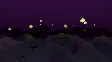
The 4th layer of the music has a sudden change of tone. It has less percussion, is quieter, but also more dramatic. So what is the best way to reflect this in the environment? Well, turning off the light naturally! I colored the sky in a dark purple (so that it is distinct from the dark blue of the first layer), and made the ambient light darker. For this I actually had to refactor a bit how the lights and color were managed in the scene. Now I can edit more precisely the color palette of each layer (sky color, fog color, ambient light intensity, sun light intensity).
To create some contrast and create interesting animations in the scene, I added some kind of large bubble of light and water floating in the air. Initially they were supposed to represent the water from the previous layer rising, but it turned out they looked better in yellow. Once again I played with shader to give them a wave effect and a gradient color. I would have like them to have a halo effect in the distance, but it is quite complicated to set up with a custom shader. So for now, they are lit like every object in the scene (despite them emitting light).
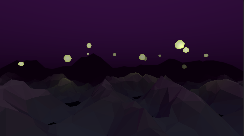
I still feel like something is missing here though. The sky looks a bit too empty. Maybe it would need some stars? I'll work on that next. But before that, I had to pause the work on the environments to tackle the UI!
A proper rhythm game UI
The reason why I needed to improve the UI now is because I want to start the promotion of the game. Specifically, what kept me busy thse last two month was a video for my french Youtube channel, which concluded it. I wanted to showcase the game in it, as it is the canal of diffusion on which I have the most reach. However, the game as it was then was still in a visible state of prototype.
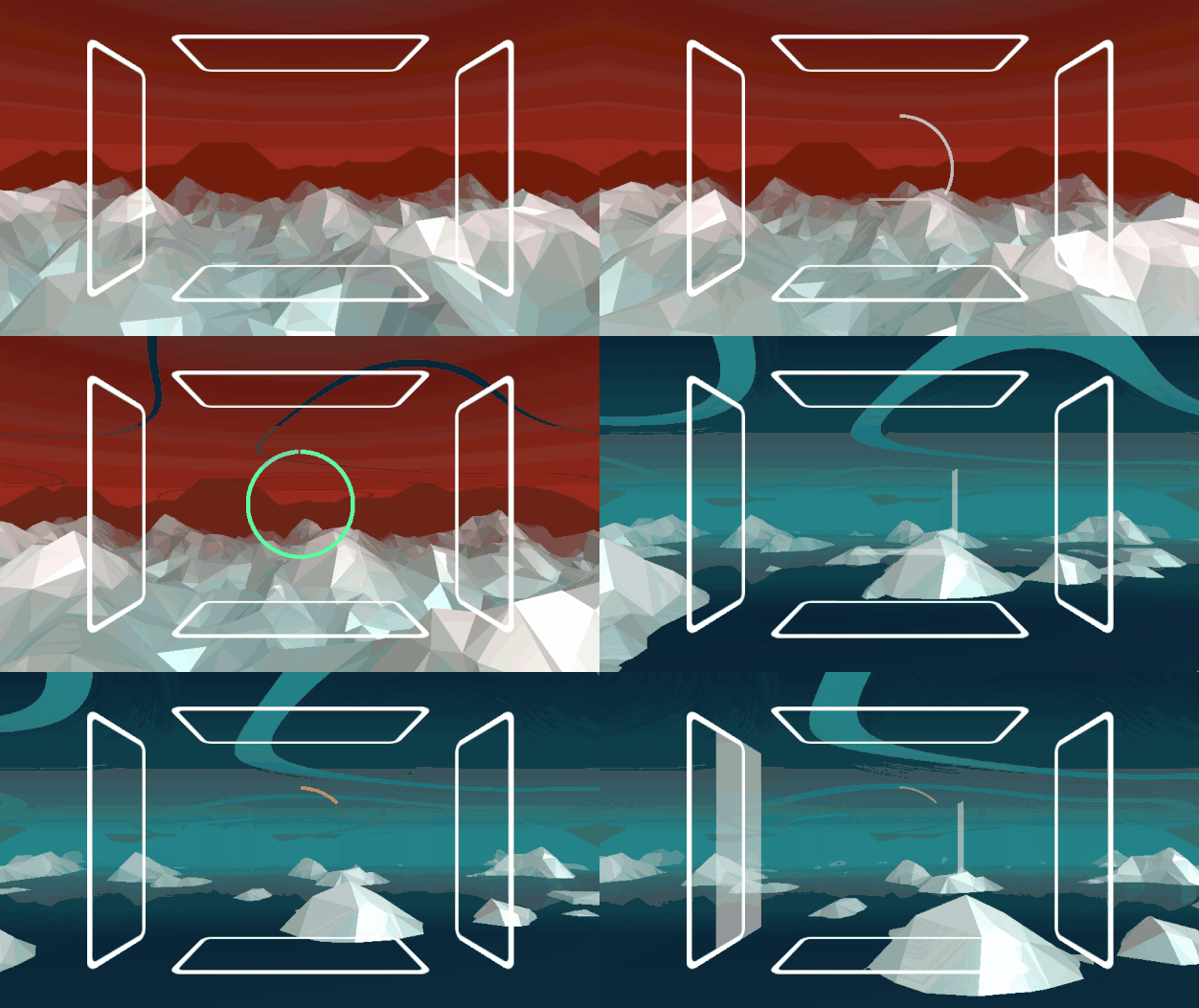
Sure, it had music, 3D environments, even animation, and was playable! But… Those white rectangles on the border? Yeesh. It shouts "Not finished"! It's the rendering of an early prototype, not proper rhythm game visuals. It's the core element of the game, so it has all the attention of the viewer. To share some screenshots of the game, I needed something cleaner. Not necessarily perfect, but at least something presentable that is close to how it will look in the final version. And fortunately, I had already something in mind:
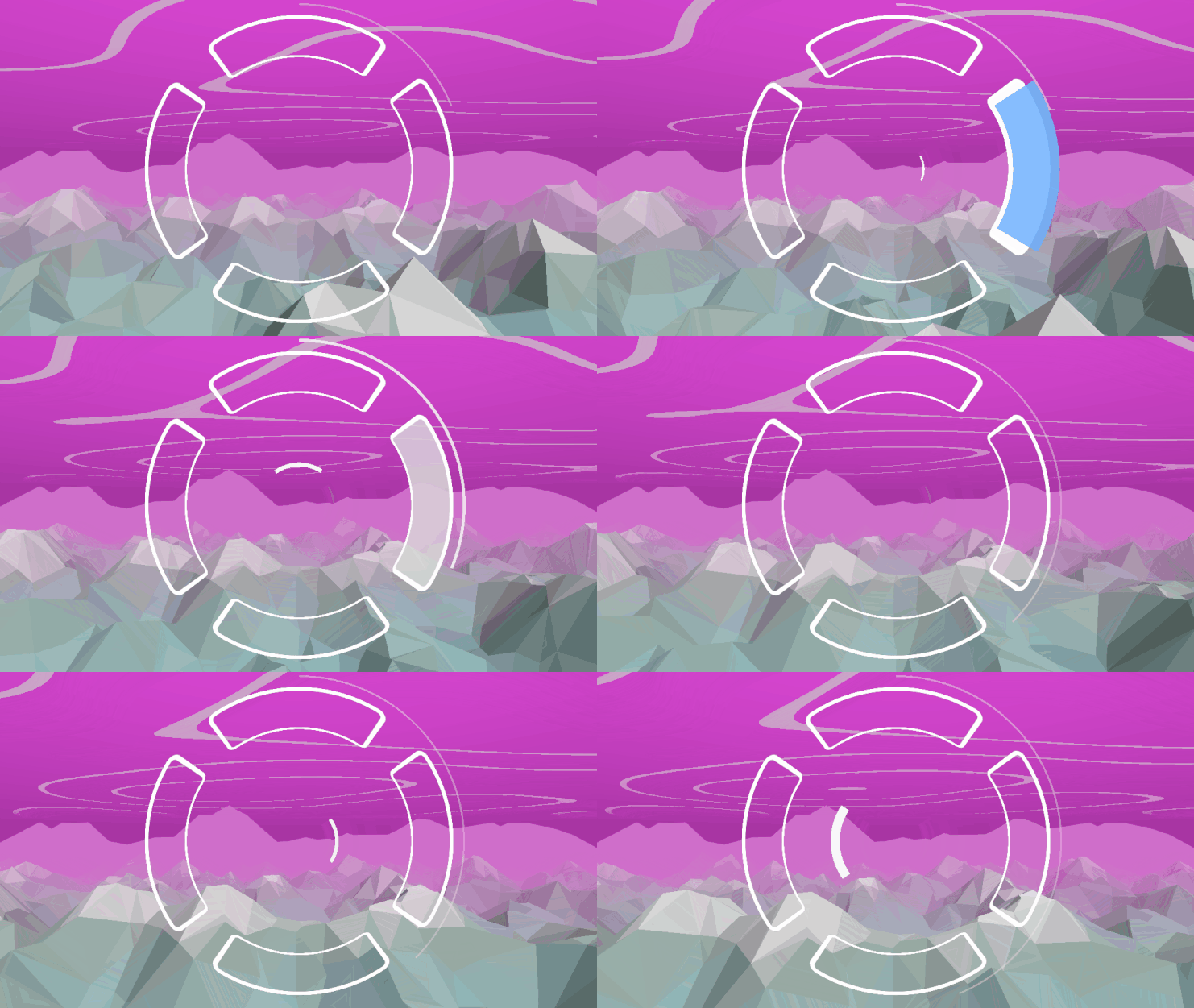
You can see the similarities with the previous version. Except that instead of being flat, the rectangles are now curved around a cylinder. Behind the hook though, these are still 2D shapes on a UI canva! How does it work?
There are still 4 UI canvas, one for each bar. Using 2D UI elements allows me to easily handle animations. The block stretches out at the start, is a bit distorted when hit, change color, fade out... All of this by using only anchors! Its displacement on the bar is from 0 to 1. And I can change the length of the container, or its margin, and everything will scale!
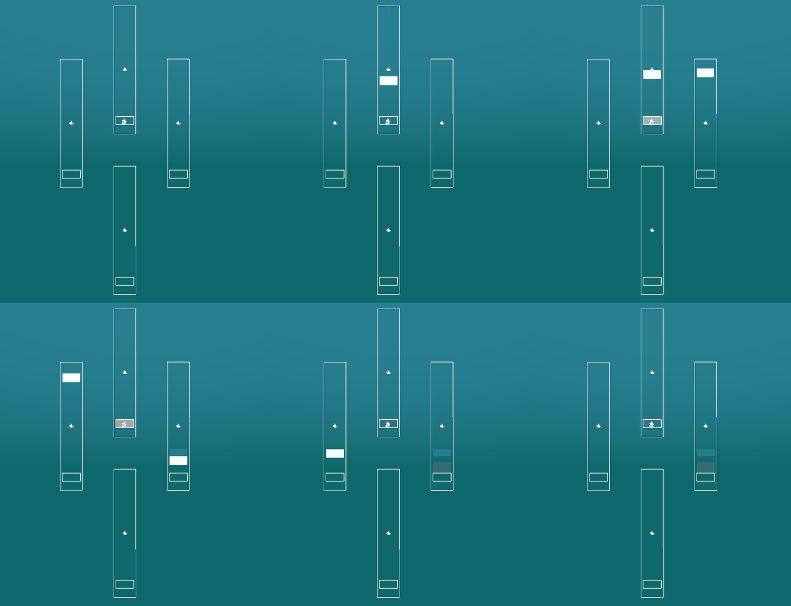
These bars are placed behind the player, where they cannot see them. Each one of them has an associated camera, that record them in real time and render in a texture. This texture is then used on a transparent quarter of cylinder in front of the main camera. This way, the player has the impression of seeing 3D objects moving in front of them.

I'm happy I was able to make this trick work! Although I must say, once again, it is a pain to make it work in Unity. The doc for every step is poorly written, and for something this common in games (placing a UI in a 3D environment), there is surprisingly few resources and tutorials. I regret having to use 4 cameras to make it work. In Godot, you can configure a mesh so that it uses a UI canva as a texture, which is much more straightforward.
Another caveat of this solution is that it can still look like 2D rendering. One person to which I showed the result didn't see the perspective at first. This could have been avoided with 3D objects that have some thickness. But they would be much more difficult to animate! So next time I work on the UI, I might add some lines to better highlight the distance. Or maybe it needs to be lit? We'll see.
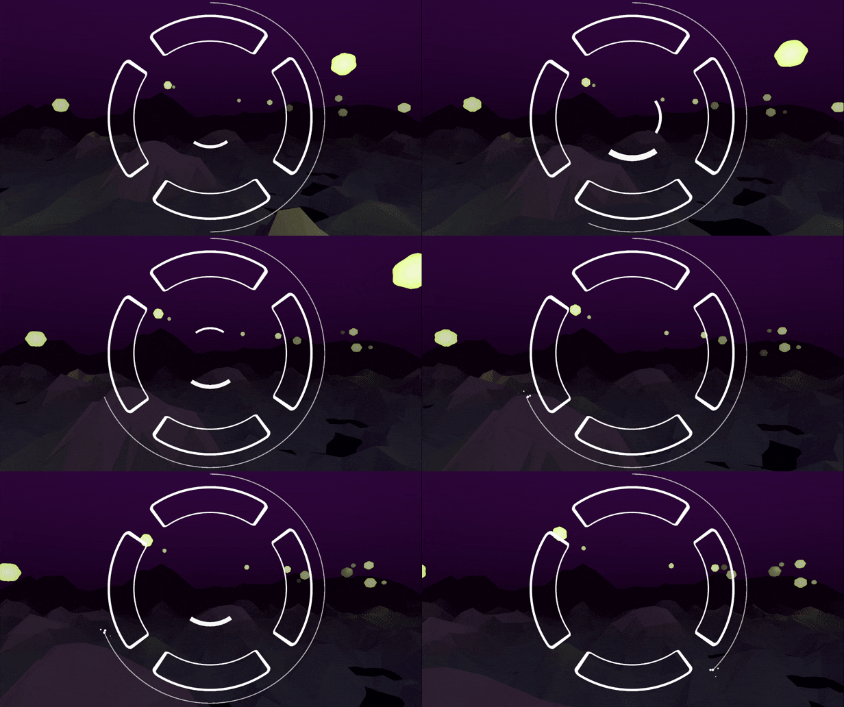
Another improvement you might have noticed is the progression circle! Instead of being in the center, I found out it was much more readable outside of the targets. It's not in the way of the block anymore, and is placed near the focus of player's attention. Also, I finally found how to represent the vulnerable state! To remind you the rules: on a layer, the player can take 1 hit for free. After that, every hit make them lose some progress (until they have none left, and go back to the previous layer). So there is a state where the player is "invincible", or rather has a protective shield, and a state where they take damage. Previously, I changed the color of the progress circle, and made it shake. But with this new disposition, it wouldn't render really well. Plus it was making the game too much stressful! So instead, I opted for particles at the end of the circle. It looks like loosen sparks from a fuse, which justifies the lose of progression. It's subtle, but noticeable, and hopefully understandable.
Starting marketing in 2024!
Now that the game is presentable, I can show it to more people. I've already put a lot of efforts in this game, and in the long run it might become a commercial project. So I don't want it to launch in silence like all my other games. So starting from January of next year, I'll start its communication. This begins with a new gamedev youtube channel that I have already created. I'll post devlog videos for Sound Horizons, to make it more visible outside of itch.io. These devlog won't be as exhaustive as here though, so I'll keep updating this one! And depending how fast the development goes, I will eventually need to create a Steam page for the game, and a first trailer. I have now just enough to show something decent! Marketing my games was never my forte, so there will be a lot of challenge and learning ahead!
Anyway, thank you for reading this entry. I wish you nice holidays and celebrations for the end of the year, and I'll see you in 2024!
Get Sound Horizons
Sound Horizons
A procedural rhythm game with interactive music
| Status | In development |
| Author | Itooh |
| Genre | Rhythm |
| Tags | 3D, Atmospheric, Low-poly, Procedural Generation |
More posts
- Final Stage Difficulty UpdateJan 02, 2025
- Devlog #13 - One Colorful ShaderDec 07, 2024
- Colorful Grid UpdateNov 22, 2024
- Accessibility UpdateSep 30, 2024
- Sound Horizons is out today!Sep 18, 2024
- Devlog #12 - Score in a procedural worldJul 08, 2024
- Devlog #11 - Menus Part 2Jun 17, 2024
- Announce trailer and official store pagesJun 06, 2024
- Sound Horizons Beta is available for play-testApr 29, 2024
- Devlog #10 - Loops and circlesApr 03, 2024

Leave a comment
Log in with itch.io to leave a comment.