Devlog #10 - Loops and circles

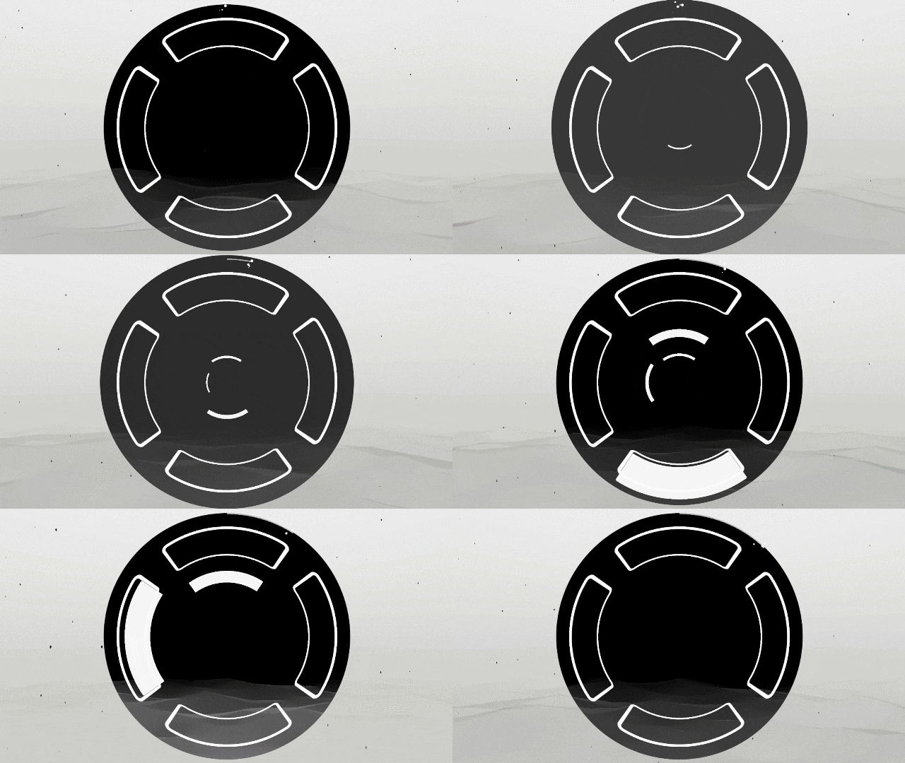
Lately I've finally been able to work on the game on a long stretch! I've made a lot of progress in just a few days. Which means that I have tons of new content to share with you! Let's get started.
The End
As announced, I worked on the end of the level. In One Colorful Grid, the game concluded with a special challenge: a 8 bar long stretch where the beats were coming without interruption, and where any mistake would lead back to the previous layer. Kind of a "sudden death" survival mode, a hard final boss to beat.
One of the goal of Sound Horizon is to make the game easier and more accessible. But that being said, I still like the idea of a challenging task to conclude the level. A final test that the player must pass, to give them a memorable victory! So I kept that idea, but toned it down a little to make it manageable. But first, a new challenge means that we need to change the scenery. And what better way to rise the stakes than to literally rise to the sky?
Because it is a special challenge, this final part is a bit different from the rest:
- The beats are slower: instead of waiting a half note, the player must now wait a full bar. This means that they have to listen to full melodies and then repeat them.
- The Final ends after 16 bars: No score based on the player's input. It is a true survival mode, with a linear progression. This challenge ends when the music says so!
- Any mistake makes you fall down to the previous layer: Still sudden death. You must complete it with no failure!

So it's still a punishing challenge. Losing it not only means that you have to complete it again from the start, but it also means that you have to do the previous layer all over again! Oof. But it is actually not that hard as it seems. Because the notes are slower, and unlike previous layers don't play on top of each other. In the end it's mostly a Simon Says. Plus, I selected the melodies to make sure that they're easy to memorize. Overall, this layer is easier than the previous two! Although it's likely that stress alone will encourage players to make mistake, I believe that with perseverance, they'll eventually manage to pass this wall. It's the end of the level after all (not to say the game, since it'll be the only one for a while), so it's expected to face difficulty here.
A note on the implementation with Wwise: I had to cheat a bit to make it work! So far, the music only used vertical layering to switch between layers, but here it needed a sequential logic to enter and exit the final layer. The layer music is this time not a loop, but a 18 bars segment that needs to start precisely on the start of a bar (actually a pair of bars), and exit at the end to transition seamlessly with the base loop set at the 6th layer. But if the player fails and go back to layer 5, it needs to transition immediately to the loop while keeping the same position in the music! Wwise allows to write sequential logic, but there's only so much it can do. You can't condition the transitions properties based on a state. So while the start of the Final segment was easy (I wait for a custom cue to trigger a transition), the exit needed to manage two different transition (either immediate fade from Final to L5, or direct jump from Final to L6 at the end of the segment). For a while I was afraid this was not possible, but I eventually found a sneaky solution by dividing the Final segment into 3 sequential segments. F1 and F2 are respectively the first 8 bars and the next 8 ones, minus the last quarter note that is in F3. This way we know that a transition from F1 or F2 means that the player failed, and so we fade immediately back to L5 (the difference between F1 and F2 is that they don't target the same segment exactly), and at F3 it means that w're at the end, and so we'll transition to L6! It has a small side effect: the player can't lose at F3. I couldn't make it smaller than one quarter note, Wwise needs that time to prepare the transition. So game-design wise, the last melody must be small enough to ensure the victory before the actual end. Hey, at least it allows the player to better appreciate the music!
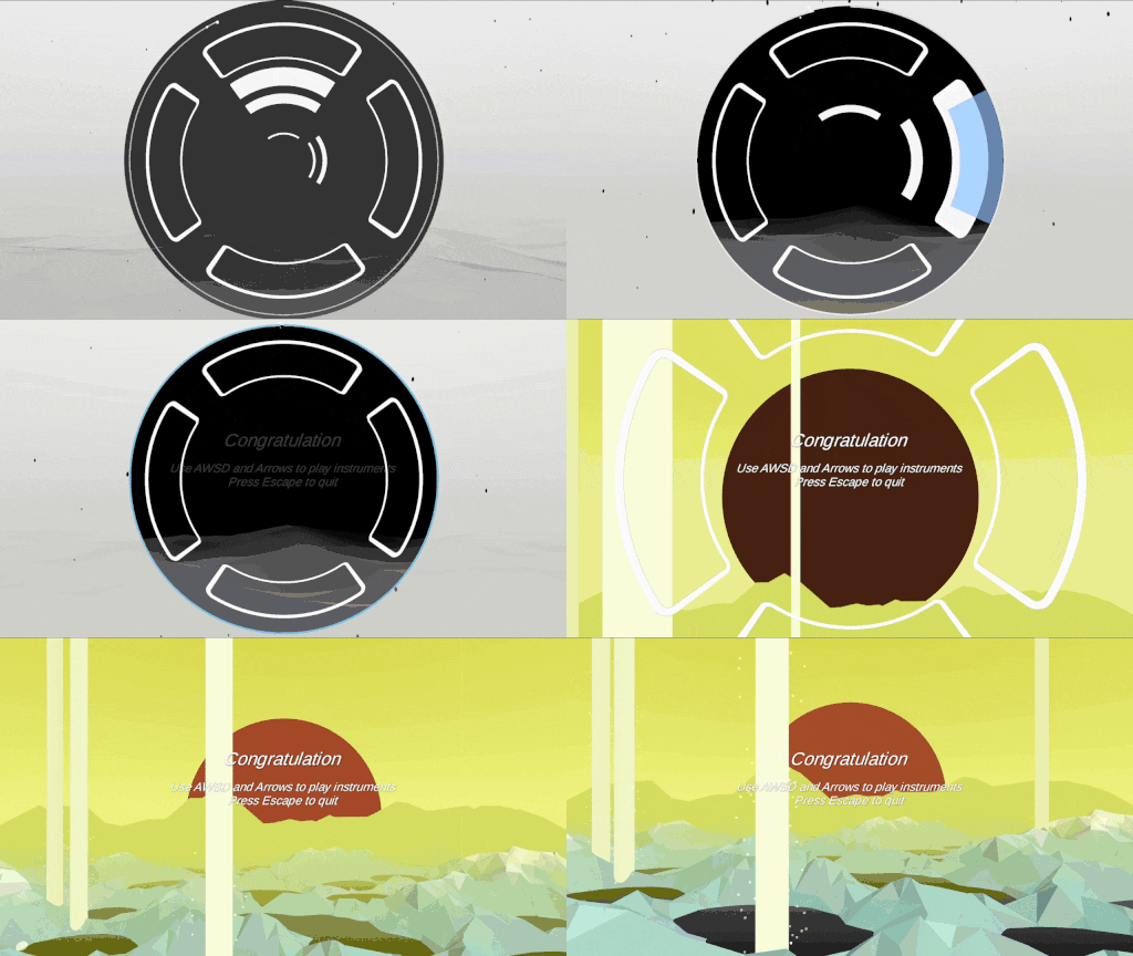
And so, the level concludes on Layer 6. But with a final reward: Free Mode is activated! I told you I wanted everyone to enjoy it. Before exiting the level, the player can play around with arrow keys and WASD to control both Lead and Player instruments without any restriction. It didn't took long to implement: I had every game events already plugged, I just had to change what the input where triggering, and deactivate a few game logic. I'm happy how it turns out, I find this very satisfying to play with. My game-design philosophy is to reward player with something meaningful and fun (as much as possible), and this feels adequate! Note that it's only a glimpse of the actual Free Mode, which will also allow to switch between layers. But for now, it's a nice way to conclude the experience.

Balancing randomness
The next step was to adjust the difficulty of layers. I had already written the melody generation so that it can be configured in different ways with Scriptable Object. I could set the length of phrases, the intervals they use, and on which beat they start. But this wasn't enough. There was still some oddities in the early layer, making them too difficult. I needed more options to better balance the challenge, and make it progress more naturally.
One of the easiest solution was to manually write a predetermined list of rhythmic patterns. After all, there's only four or five kind of possible intervals (from eighth note to half note). and phrases are not so long. So for some layers, I just wrote a list of interesting but not too challenging phrases, and let the melody maker pick a random one! I've even make it so it can select them in order, or depending on the progression in the layer! This way a single layer can have its difficulty increase once the player reaches its half. It was especially useful for the tutorial, where I needed the player to face very easy patterns for learning the rules step by step.
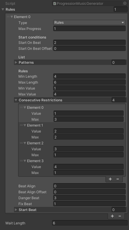
But this wasn't enough. I realized that there was actually tons of interesting patterns I could imagine. One of the strength of procedural generation is the discovery of unexpected emergence, and I didn't wanted to lose that. I still wanted a system that could generate truly random melodies just by following rules! For this, I had to identify what could be source of difficulties, and write rules to avoid or encourage them. For example:
- Starting on a bar is easier, so we can force that at the beginning, and then start on half notes or quarter notes, and only very late on eighth note.
- Keeping a rhythmic pattern on a "grid" is crucial to make it readable. Quarter notes are easy to identify and repeat, they are played "on the beat". Eighth notes are essential to make the pattern interesting, but they should emphase a beat next to them, either just after or before. The math rule to follows that is that the sum of all the intervals must be even
- Dotted notes are tricky, especially quarter dotted notes. It's not always easy to tell when they'll land. But they are essential to place half notes at the right place! So to re-balance them, I made as a rule that "a dotted note must be followed or preceded by a eighth note". It's a bit arbitrary, but surprisingly it works.
- Too many similar consecutive intervals is either boring (for quarter or half notes) or too much challenging (for eighth and dotted), so I limit them accordingly per layer
- To play offbeat, we must start offbeat and then respect the grid rule above (always keep the sum even). This is useful for Layer 4 that is themed around offbeats, and uses a ton of rules to play on them!
Writing these rules and using them was both a mathematics and a level-design challenge! Not enough rules, and the difficulty was uncontrollable. Too many, and it becomes boring. I've eventually reached a satisfying point, generating easy melodies in the first three layers that gradually becomes more challenging, then offbeat melodies in the fourth layer to then conclude with completely free and tricky melodies in the last layer! It was a lot of tweaking with abstract numbers, but it makes a hopefully satisfying progression in the end. Some layers might still benefits from hard written phrases that can't be generated with these rules though, so I might mix them up a bit in the future.
New (and better) lanes
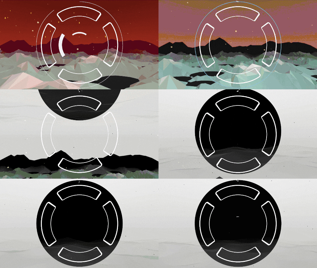
And finally, I've been able to redesign the game UI! The one you see on the previous screenshots had several problems. On top of its "early prototype" look, it wasn't precisely aligned with the rhythm. The duration of the block movement was exact, but not its size or the tile length! Making it very difficult to determine when the note should be pressed, or when it was too early or late. That's because I used a fixed size for these assets, and from now I just approximated by myself how long they should be. A rather clumsy solution, especially for a precise rhythm game! It was even more obvious on the Final challenge, where the blocks width and position weren't matching at the timing at all.
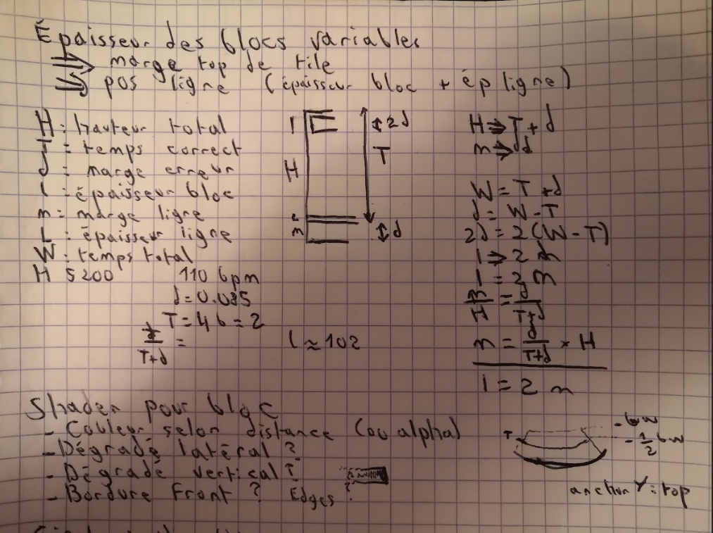
So the first step was to write a script to dynamically scale the UI according to the timing. We know the timing of the delay (T), as well as the precision margin (d). If we decide that the length of the bar is a constant (H), then its length is equivalent to T+d. So with that, we can calculate the size of the block or hit zone (twice the precision margin, so 2d = 2(d/T+d)*H), and the position of the exact target (H-d)!
I decided first to make the target a line at the end of the lane, and make the size of the block match the precision margin. It showed me how much I my initial estimations were off, and how generous much the game's timing actually was!
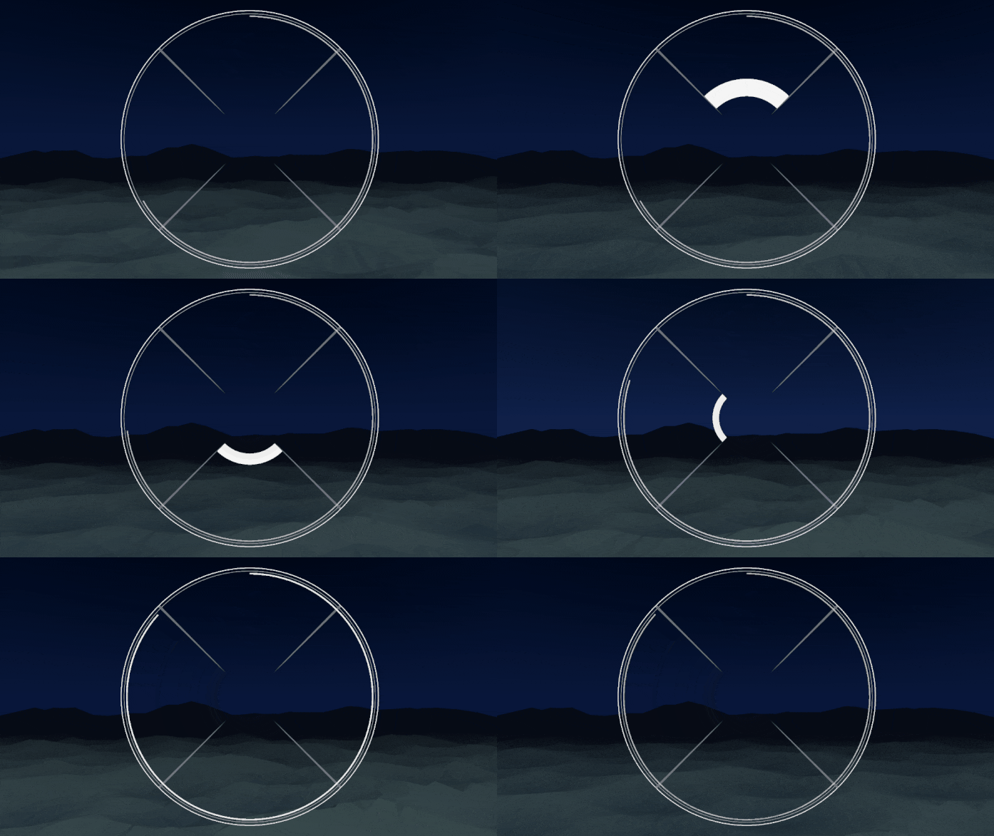
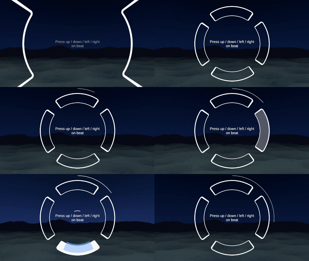
Having blocks this large was not ideal. But at least the visuals were exactly matching the timing now! So it was time to decide how the UI should look. I looked for inspiration in other (less known) rhythm games that uses similar circular interfaces: Music Diver, Lanota, WAVEAT, Rotaneo, Liminality, WACCA… Although some had aesthetic very far from what I was looking for, they propose interesting ideas on how to handle the perspective and the circular aspect. One of the feedback I once had is that the perspective was not easy to see, and it could easily be interpreted as just 2D flat visuals. So I added perspective lines on the corner to better emphase the perspective, and put a net separation between the lanes. Also, while I initially wanted the hit zones to be separated in order to let the UI "opened" and mix it better with the landscape, I eventually found that drawing it on a full circle was aesthetically more pleasant. It's easier to see the forward tunnel this way!
But the major improvement went with the limit line. In the screenshot above, I experimented with putting the target (the exact moment the player must press the button) on the very limit of the cylinder (just on the circle). But with the hit margin being so large, it wasn't making very clear when it should be pressed. On top of showing when to hit, the UI must also showcase the offset between the player's input and the target. When they pressed the button a bit earlier, or a bit latter, while still being inside the margin. Using the limit as the target doesn't allow to see that: you can't see where the margin begins, and the block disappear when it runs over the limit, making it impossible to read how late we are. Plus it creates some confusion: should I hit just when the block touch the limit, or when its center is aligned? So instead, I used a second line to represent the target, placed at some distance of the limit. The blocks become thinner, encouraging to align them exactly. The circle limit now is the limit past which it is too late. And to be able to see the margin zone, I filled it with a transparent gray.
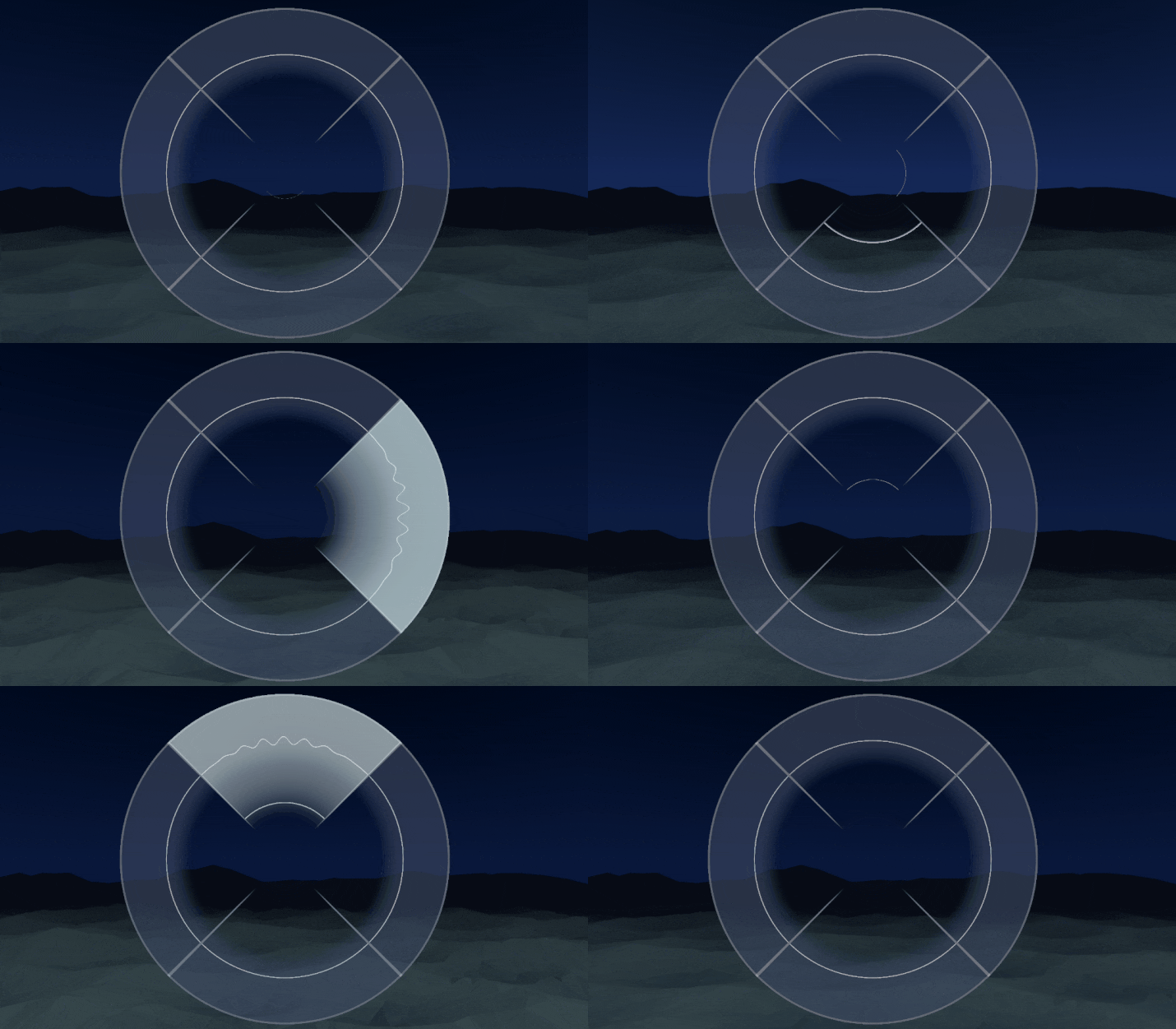
I made these visuals once again with shaders. I could have drawn separate sprite assets, but that would have make a lot of back and forth between two editors, and I am a lazy developer. Writing a shader just to draw a rectangle might feel over-engineered, but it then allows me to directly tweak the material properties to experiment different aspects directly within the game! I could configure the gradient length, the alpha strength, the widths… And also create neat animation effects! One I'm the most proud of being the vibration of the line when it registers a hit. It really makes you feel the impact! A small but important one is also the block's color fading with the distance. Remember that this is an unlit 2D texture. So I apply a custom fog with the distance, that let blocks be still visible when they are afar, but slightly darkened so that you see better the perspective.

Eventually I found a solid look for the block, that doesn't use any gradient at all. Too much gradient can be noisy, there are time where even I can enjoy a flat design. I also turned off the perspective lines by accident, and found out that it gave more space for the UI to breathe, allowing the player to better see the environment in the center. So it's just a circle now, and it looks great!
I'm finally happy with how the game looks! And it's now playable from the beginning to the end. There are some bugs and details I have to fix here and there (I'm mostly not yet happy with how some of the instruments sound). But there's not a lot left to do before I can build and distribute a prototype version for play-testing! Something that I should have done a long way ago, actually. I've polished all the sounds and visuals before play-testing the actual game! There was two reasons for it. The first is that there was still some problematic aspects of the game that I knew I had to fix before sending it to play-test: balancing the difficulty, making the UI readable, fixing some bugs… I knew that if I sent the game as it for play-test, the feed-backs I'd have would be on these points. It wouldn't be productive. But then why didn't I prioritize those? Well, truth is, I prioritized the aesthetic because this project is an aesthetic game above all. I designed it as a musical and visual experience, meant before most to immerge you in a great spectacle. Sure, I hope it'll be fun to play too, but the main attraction is the art. It is the most ambitious aspect, so I put it on first to concentrate most of my efforts on it.
If this was a commercial game, this still wouldn't be a good excuse. Play-testing it this late is definitely a mistake. But I'm also making this game as a personal exercise, and if it isn't successful it will still be a good asset in my resume! But anyway, next time I'll probably ask for some people to try it and give me feed-backs. Let me a comment if you're interested!
Also, to complement my previous post on the mountains shaders, I've made this video detailing some tricks I learned on Unity Shader Graph to create low-poly terrain. Check it out if you're curious about that subject!
Get Sound Horizons
Sound Horizons
A procedural rhythm game with interactive music
| Status | In development |
| Author | Itooh |
| Genre | Rhythm |
| Tags | 3D, Atmospheric, Low-poly, Procedural Generation |
More posts
- Final Stage Difficulty UpdateJan 02, 2025
- Devlog #13 - One Colorful ShaderDec 07, 2024
- Colorful Grid UpdateNov 22, 2024
- Accessibility UpdateSep 30, 2024
- Sound Horizons is out today!Sep 18, 2024
- Devlog #12 - Score in a procedural worldJul 08, 2024
- Devlog #11 - Menus Part 2Jun 17, 2024
- Announce trailer and official store pagesJun 06, 2024
- Sound Horizons Beta is available for play-testApr 29, 2024

Leave a comment
Log in with itch.io to leave a comment.