In Octave Devlog #3 - Circles solve everything
So far I've been writing these devlogs on Monday evening. However, I've come to notice that they take a while to make, and more than often made me write long after midnight. Which, during a working week, isn't very healthy. So I will move them to Friday evening, when I can have plenty of rest the next morning!
These last two weeks, I've been working in the game's visual. First to show player informations and feed-back they need, then to make the game look a little bit prettier. The first element to show is the game progression.
Let's draw a circle
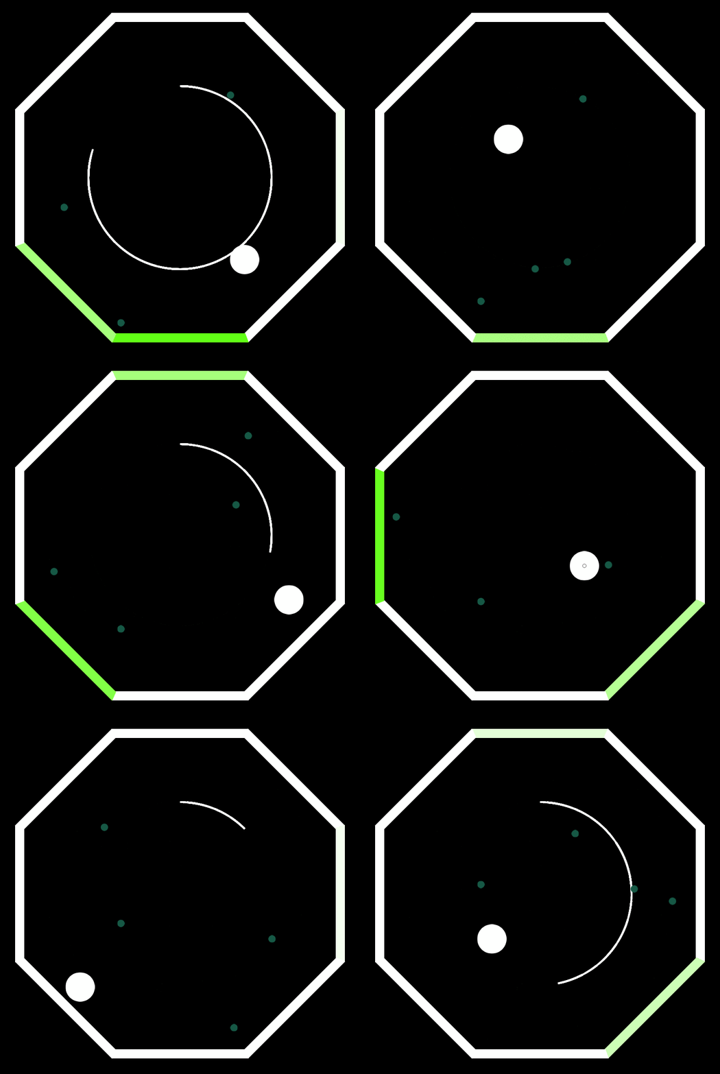
As I detailed last week, the goal of the game is to let the balls bounce a given number of time (the more balls there are, the more they have to bounce) in order to get to the next level, where the player will have one more ball to take care of. I certainly didn't want to write those rules in the game (it would only be confusing). What I wanted is a progress bar, that would indicate clearly to the player that they are making progress, and how close they are to the goal. And because I wanted to keep the radial symmetry of the game, I opted for a circle!

This is the first time I make this kind of animation. I learned a lot of things about HTML5 canvas along the way! It's not perfect, I have to draw (and erase) the circle segment by segment in order to create the animations, and keep its current position. I'm satisfied with how it looks. Especially with its smoothness, it uses a sine function to stop gracefully instead of abruptly.
One dilemma I faced was how to end it. As you can see, once the circle close, it becomes yellow and fade out. So the question is: when does the player get to the next level? When the last ball hit a wall? Or once the circle closes? I've tried this last solution, but quickly went back: it felt weird to have the UI decide of a game event. It just creates a whole lot of new problems (is the level validated if the player get hit during the animation?). Plus, the sound of the ball hitting the wall being simultaneous with the level change is a too great feed-back to be replaced. So, the level ends once the last animation begins. This means that if the player is fast enough, they can draw another circle on top of the fading one. Hence the yellow color, to dissociate the two! Fortunately, it disappear quickly enough, so it's unlikely anybody notice something weird.
Something I still have to decide is the circle's radius. Initially it should have been outside of the octagon, but this would reduce the arena, and put the information outside of the action. It's pretty nice outside. But should it remains in the middle like that? Maybe a very large circle, or a really tiny one, would be less disturbing. But would they be as readable? And should it be drawn on top of the player and the balls, or in the background? Maybe I should give it a bit of opacity… To be continued.
Let's draw more circles
The next information the game must provide to the player is the number of balls they can shoot. Initially I planned to just draw them on a side, in some kind of ammo bar that would get larger as the player progress in the game. But again, it would put the information far away from the player attention, and requires a dedicated space! What if I draw that inside the arena too? In fact, I already faced the same issue in a previous game, Tabletop Dance. The two games share a lot of similarities already! And here, I found a nice solution; drawing the ammo directly on the player! After all, they are sure to look there. Maybe I could apply this solution here as well?
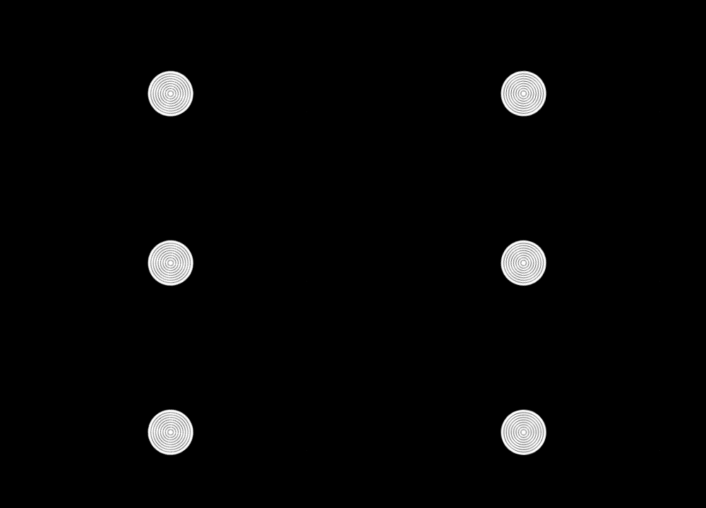
One problem though: I need to show the player how many balls they have. Or at least, make them understand that they have more than one ball to shoot. So instead of a single sprite, it needs something dynamic! My first idea was to draw a single filled circle, and make it grow as the player would gain more balls. The larger (and "heavier") it was, the more the player has to shoot in order to be "empty" again. But I accidentally found another solution: what if I draw several circles, one for each balls? The result can be seen in the gif above: when the player has a single ball, it is represented as a single circle in the avatar's center. Then if a second ball is obtained, another larger circle is added. Here is what the player looks like when it has 8 balls in stock (the maximum possible in the game):

It's not a bad look! Sure, it's not easy to tell exactly how many balls the player has, but that never was the purpose: the player must just feel that a ball has been added or removed. The only drawback is that I can't animate that easily. So the only animation there is is when the player obtain a new ball when reaching a new level (it's very short, and practically unnoticeable). Otherwise, the circles are just added and removed.
Fun fact, the first time I implemented it, I stumbled against this glitch:

Turns out the player (and probably the balls too) was spinning without it was noticeable! Well, it makes sense after all, the physics engine does what it should. So I stopped being lazy and fixed the object's rotation. But I must admit, I liked this vinyl look.
Make it shine
It's time to give this game some colors! The black background is getting too dull. And while I still aim at a minimalist visual, I want to have a dynamic background. And I already had something in mind…
What if each level had a different background color? And what i when progressing in a level, the color would fade from the current one to the next one? Combined with a generative music, it could create some tension, and make nice transitions. And it's more or less the same behavior as the circle! But instead of using plain colors, I've used circles again to create a radial gradient. The result looks like this:

Now that's more pleasant! I've made some experiments with different colors. When there is a strong contrast, the gradient is very obvious from the start, and makes the progression really intense. However, the ending animation is a bit violent. When the colors are closer, the gradient is not obvious at first, but becomes apparent when the circled is 3/4 completed. And the transition between two level is smoother! I think I will use the two. On the first levels, it will probably be only bright colors. But for the last ones, I will alternate between very different colors, to create a more tense atmosphere.
One thing you might have noticed as well is the trail behind the balls! I think they are necessary to make the game more readable, and show clearly the balls directions. They are created using particles. Again, my first time! If you look closely, each particle is a circle created with a radial gradient again. They are not so close from each other, unfortunately I can't spawn them more frequently. I guess we'll see how it look once I'll have established the ball's size and speed. Also, I the trail to be longer, but creating too many particles was making the framerate to drop. There's not infinite memory in a web browser… So this seems to be the maximum I can do. Again, we'll see later how it looks. I hope it will still look nice if balls go faster.
Visuals are not complete yet, but next week, I want to focus on the game balance. It's time I set the sizes of these objects, and how fast they go. Plus, I have some little extra surprises to add… By the end of this, we should have an fully playable game! See you then.
Get In Octave
In Octave
A musical dodgeball
| Status | Released |
| Author | Itooh |
| Genre | Shooter |
| Tags | Bullet Hell, Music |
More posts
- In Octave Devlog #9 - And… TIME!Jun 24, 2018
- In Octave Devlog #8 - Finish LineJun 15, 2018
- In Octave Devlog #7 - Press start to playJun 08, 2018
- In Octave Devlog #6 - a m b i e n tJun 01, 2018
- In Octave Devlog #5 - Generative MusicMay 18, 2018
- In Octave Devlog #4 - Evil schemesMay 11, 2018
- In Octave Devlog #2 - How to tune your octagonApr 23, 2018
- In Octave Devlog #1 - Shooter meets breakoutApr 17, 2018
- In Octave Devlog #0 - It's a new thing alrightApr 09, 2018
Leave a comment
Log in with itch.io to leave a comment.