Bazza Nava Devlog #7 - Make it fancy
This is most certainly the last devlog before the release of the game. Last time, we had a functional game, that didn't look particularly pretty. So the final stretch consisted in visual design and a bit of polishing to make it pleasant. That's how I proceed for most of my games, especially since I make mostly musical and narrative games.
Decorating
The empty squared room I made is quite dull. Well, that's partly the purpose: a boring rehearsal room, that becomes chaotic once the game is started. But it still lacks details. The room must feel alive, authentic, it must give the impression that people come and go in it. Not just a game space, but a place with a story.
First thing, the walls! Even if I gave them different colors to differentiate the floor from the roof (thus not giving the impression of an empty cube), that wasn't enough. They needed to be filled with something to not feel too boring. Here is what I decided:
For the roof, since I changed the lightning of the scene, I could put some light-bulbs. In this case, halogen tubes felt more appropriate. It doesn't draw attention, and have a bit of industrial or bureaucratic feel. It's what is mostly used in these kind of impersonal rooms. Also, it's kinda cheap to make. I just used white cubes, and the illusion is perfect. I cheated a bit for some of them: they are not exactly where the light is emitted. I moved them a bit so that they appear on camera. Not that they are particularly pretty, but without them it creates an unpleasant asymmetry.
Next, the floor. Instead of a flat texture, I decided it would be a carpet with a dull abstract pattern. It makes sense to have this kind of floor in such a place. I played a bit with squares in SVG, until I found something that looked nice enough. Initially I intended to make the dark color prominent, but the contrast works actually better if the light color fills the most space. Also, since I do not use a cartoon look anymore, I added a normal map with random noise to give some kind of carpet texture to the floor. The result is already less boring than the previous floor. The presence of shapes, even if repetitive, gives something to the eye to look at.
Finally I wanted to put things on the walls. It could be windows, but that would create tons of new problems (how to render the outside, should I animate it, how to manage lights, etc…). Let's say that for acoustic reasons, this room has no windows. True, I envisioned to make an abstract sky that would evolve with the music, but this was far too ambitious and certainly not fit in a "final polishing" plan. Instead, I opted for posters. What could be displayed in a music room? Rules? Photos? Concert ads? Art? Music sheets? Actually that last one is unlikely (you use sheets, but rarely display them as some kind of art). A list of rules would be interesting, and has potential for adding some humor (like “Please do not throw instruments around or make them fly”, “Respect the universal laws of gravity”, …), but that would not be great visually, and would draw attention on itself. Bazza Nava must feel fun and childish. So let's avoid text. Photos are as well prohibited. Even if I moved away from a cartoon style, I don't think realistic images, or even figurative ones, would really fit. I should stick to abstract, pastel colors, basic shapes. Like the poster already present on the end of the room! I could even use the same visual and put it on both side wall. That would be consistent, but not very creative. Instead, let's opt for the two other things: concert ads, and art.
The concert ads was quick to make. I had some colors in mind, and just used very basic shapes to have a background with the feeling I desired. Then I used some references to place text as if it was a display of an event programming. Well, “text”… As said, I didn't want text. So instead I used basic shapes that look like pixelated text. Sure, the poster will be close enough to allow players to instantly see that it's gibberish. But it doesn't matter, it gives the place a kind of abstract feeling. Like a dream, it's the idea of an ad, not an actual one.
Then the came abstract art. Haha, it's less easy to cheat for this one. Maybe this is an art school, and if an art is displayed here, it must be because it's great enough to be kept somewhere else than an exposition. So I have to make something truly good this time… Damn', that's not part of my skills! I did a first attempt at some kind of monochrome shapes… Like something made with pencil, that vaguely evokes a music sheet in a minimalist way. That wasn't really a success. The black & white poster in the colorful room looked like some kind of mathematics formula. Even after trying to add color, it was absolutely ugly.

So plan B: I opened GIMP, generated “plasma clouds”, then used tons of filters to distort it and change its color, until it was pleasant enough! I finally obtained, by posterizing, something that look like splash of paints. I then added a canvas texture, and voilà! Abstract art quickly generated ans still visually interesting, checked.
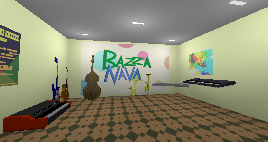
By now, this is how the room looks like:

Already much better! The details make this place way more authentic. Especially the posters, indicating that this space is made for people. However, it's still feel empty (even with the instruments). Almost like a cell. Time for phase 2.
Furnishing
The room needs more objects to feel authentic. First, supports for the instrument. Do you see that flying keyboard? And this vibraphone (actually a xylophone, but shush)? And who would just put an organ directly on the floor? Or even a flute! We need appropriate supports, and at least a table. Then comes almost logically the chairs. This is not a storage room: we must have the tools to use the instruments. For the keyboard, I even made a stool, for variety sake (and also because everyone is used of seeing those for piano players, idk it's just fancy, I like it). Finally, to add even more details, I added two amplifiers. There's always one of those in music places! Not only it's relevant to the room, but it can also be used to place instrument on them! This is something I discovered while arranging the models: by setting “interactions” between them, I strengthen their presence in the room and gives them a bit of story. Finally, I also wanted to add a mic stand, but couldn't find a satisfying model (that wouldn't look like an odd cylinder). Voice is not an instrument in the game anyway, so maybe it's for the best.
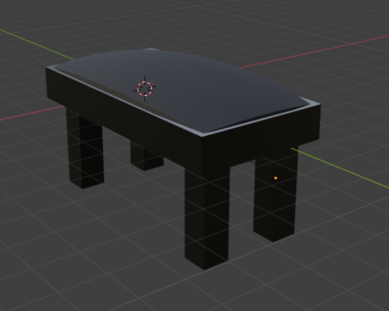
The models were mostly gathered from free assets stores. Yeah, tables and chairs are not too much complicated, but I prefer them to have little details and be a bit polished, instead of being clumsy models from the beginner that I am. Hey, I still made some of them! The piano stand and the vibraphone stand are mostly cylinders, so I could do them directly in Godot. (again, the vibraphone stand is not at all how an actual vibraphone stand looks like, but just don't pay too much attention to it, ok). As for the piano stool, I was able to do it in Blender. I knew in advance the basic shapes and textures I would need. So yeah, quite proud of it!

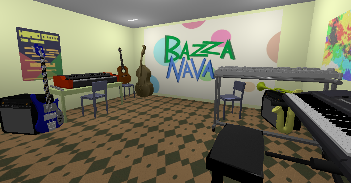
Placing them in the room then presented a bit of challenge. Each objects had to be in a position that felt natural, while also ensuring that the « Bazza Nava » logo is not hidden, and every instruments is visible at the start of the game. As mentioned above, I used the amps and the chairs to position some of the instruments. There might be no good reason to place a guitar in a dangerous balance on a chair, but it makes it high enough so it can be seen behind the organ! Speaking about balance, I also had to find the right position to not make the instrument fall at the beginning of the game (in which they don't fly, more on that later). For some it was easy, for other, standing against a wall or even another object, a lot of tweaking were required! But the result payed off!

Now that's a room that feels natural and alive! It's inviting, it has purpose. Of course, you could always be nitpicking; where are the electric plugs? And the cables? There isn't enough chairs or amplifiers for all the instruments. Etc… But the illusion is here, and that's what matters.
Notice that unlike the instruments, the furniture are bound to gravity. It creates a fun contrast between the flying instruments and the tables that just lie down and get pushed around. More than they should do: I set object's weights so that they are all quite light (even though some are a bit heavier than others). It's less realistic, but it's just more fun to flip a table with a flute.
Last changes
I added some little game mechanics. Some already planned, some not. First, I locked the shader interaction so that it's only available once all the instruments have been played once. The purpose is to control a bit the player's experience. They should first interact with the instruments, then with the shaders. It's a bit artificial, and not usually my kind of game-design (I don't like authoritative rules, and prefer giving agency to players to let them experiment and follow their own natural path), but I felt it was important to not let them activate the effects by accident right on start. After all, it's only a bonus, and they should first learn the main mechanic before exploring this one. Of course, there is absolutely no feedback once the effects are unlocked. After all, it's a secret! I'm still confident that players will try to hit 0, even by mistake.
In the same order of idea (shaping the experience), I activated gravity on the instruments at the start of the game. They only fly once they have been played once. It creates a more progressive chaos. Instead of having all the instruments immediately flying in the room (it happens quickly when they bounce on each other), they go in the air one by one. They are still a lot bouncy, so it's a bit strange when some of them fell on the ground. But modifying this property is not worth it. It's still funny as it is.
Last, I edited the organ to make it play chords instead of single note. The way it works is that when it has to play a note, it selects randomly 1, 2 or 3 different ones, based on the probabilities. Then it selects their octaves to make them close to each other. I tweaked that section a bit to allow the organ to play on a lot of octaves (otherwise it gets too much repetitive), but not wander too much in the lowest or highest notes. Since it selects several note with different probabilities, there is a very good chance that it always select a "strong" note, thus always sounding right! The result is nice, and makes the instrument stand out.
There was also a couple of bug fixes. Mostly one about performance issue. Now that there are several models in the scene, there is a lot of textures to load! Unfortunately, the way Godot works today, it put the textures in cache only once they appear on screen. Meaning that my intro (the camera scrolling) had a lot of stuttering. The solution to that is simple: create a lot of quad meshes with all the materials in the game, place them in front of the camera (but backward so that they are invisible), then remove them once they are loaded. I did all that by script, and am very glad it works! Fortunately this will be fixed in Godot 4.0.
And there we are! There is just one little bug I have to fix: sometime the flute is pushed too hard and gets out of the room. Maybe it does some kind of long backward jump or whatever… Anyway, not a hard thing to fix. I'll just put it back in the scene if it flies too far away, and nobody will see a thing!
I plan to release the game next week! I'll just have to prepare the game's page, add some screenshots, and it will be live! The next thing I'll do is working a bit more on the Godot sampler add-on I used for this game to make it separately available as well. I'm quite excited to share Bazza Nava with you. I hope you will enjoy the game, and that you found this devlog interesting!
Get Bazza Nava
Bazza Nava
A silly and relaxing musical toy
More posts
- Bazza Nava Devlog #6 - A matter of presentationMay 22, 2020
- Bazza Nava Devlog #5 - It's Shader TimeMay 03, 2020
- Bazza Nava Devlog #4 - Music for space stationsApr 19, 2020
- Bazza Nava Devlog #3 - NOW IN 3D!Jan 05, 2020
- Bazza Nava Devlog #2 - Impro MachineOct 07, 2019
- Bazza Nava Devlog #1 - Music SheetSep 13, 2019
- Bazza Nava Devlog #0 - Back to musical toys!Sep 06, 2019

Comments
Log in with itch.io to leave a comment.
Nice write up and nice job! I find the new visuals fitting the game very well =)
An idea for the flute: you can also setup a continuous collision detection (instead of the usually default discrete detection) or make the exterior wall thicker.
Good luck the the final steps !